Events Website for WeWork
Help people easily discover WeWork venues to meet their various event needs

As a workspace provider, WeWork aimed to introduce a revamped Events product that offers bookable venues for corporate and social gatherings
PROJECT BACKGROUND
As a product manager at the time, I helped to drive the strategy & launch of an MVP Events pilot with limited resources. I challenged myself to design the next iteration of the Events website to envision a more user-oriented solution that could effectively scale with the product.
CHALLENGE
Redesign the WeWork Events website to help people learn about the new and improved Events product offering.
OUTCOME
I designed an event venue inventory search experience that allows people to quickly navigate and discover WeWork venues and services that may fit their event needs. By supplying more informaton relevant to their priorities, users can better understand the offering and action on it.
Note: This UX study was done purely as a learning experience and was never formally submitted.
All venue photographs used in this project do not belong to me.

Want to learn more? Feel free to dive into the process or skip to a section of interest!
THE PROCESS: DISCOVERY | SYNTHESIS INSIGHTS | IDEATION & ITERATION | FINAL CONCEPT | REFLECTIONS
DISCOVERY
The Events website was not built to support a scaling product and offered less information compared to key competitors
The original Events homepage was created under challenging circumstances—very limited developer support and a tight turnaround time. While the site was enough to support the small-scale pilot, there was an opportunity to rethink the user experience, as well as strategize on how the website could: 1) be better unified with the rest of the WeWork website and 2) support the product as venue inventory scales.
I first conducted a variety of research to analyze the current state. This included completing a site analysis to identify areas for improvement, a competitive assessment to compare against the market and interviews with WeWork event operations leads and past event customers.
The competitive assessment (above) indicated that a dynamic inventory search was the mechanism of choice for key competitors with larger geographic portfolios, while those with smaller portfolios relied on card tiles (like WeWork)— suggesting search is best for scale. Competitors used a range of ways to showcase venues, from traditional text and pictures to floorplans and interactive 360-degree views.
SYNTHESIS
Primary users are busy professionals looking for a unique and convenient space to host their next corporate event
I used affinity mapping to synthesize interview findings. See below for key takeaways.
“I want to have as much information as possible from the website
before having any human contact.” — past events customer
No time to spare
Leveraging research insights, I developed a persona to better empathize with user needs. For a busy user like Elizabeth, it is key to provide an experience that helps her quickly decide whether WeWork has the venue & service that fits her needs.

OPPORTUNITY
How might we help users easily discover WeWork venues so that they can quickly decide whether it fits their needs and act on it?
DIRECTION
I tightened my design scope by establishing direction with constraints
Before ideating, I set constraints based on my knowledge of the product and in-house capabilities:
✖ No pricing display. Because the product was still in pilot stage and would gradually expand geographically, we needed more inputs to calibrate pricing before publishing final rates. Requiring a quote request is a common practice in the industry anyway.
✖ No availability dates. Our back-end tech did not have the capability to surface this information to customers any time soon.
✖ Therefore, no direct booking. Given the above, booking in real-time would not be possible. Since our events are larger-scale (min. 30 guests) and more involved, direct booking also posed operational risks.
IDEATION
Exploring ways to deliver an easy and informational search experience
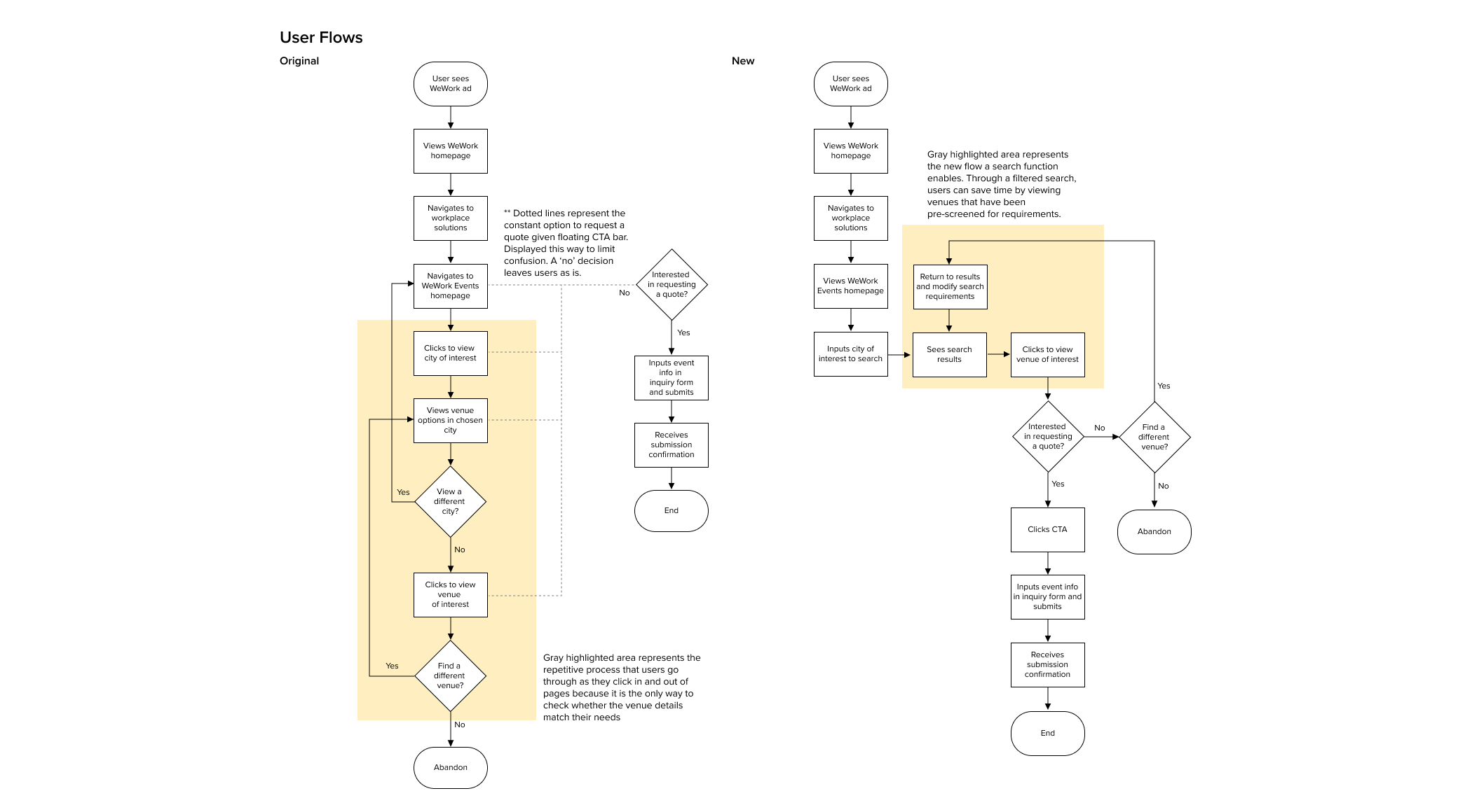
I mapped out the user flow for an inventory search to break down the steps in the process. I then brainstormed attributes needed to filter the search, as well as to describe the venue to ensure there is sufficient information.
Those ideas guided my sketches as I designed ways to achieve effective information hierarchy. I consistently referred to the primary user’s priorities, as well as WeWork’s main website design to guide the ideation. Taking my best ideas, I elevated the sketches to wireframes.


TESTING
Testing revealed it’s not simply about supplying users with information— it’s a matter of how early you provide it
I turned my lo-fi wireframes into a mid-fi prototype for usability testing. The new design offered a more efficient discovery process via an inventory search and more relevant information to help with decision-making. The design was also modeled after WeWork’s co-working website to establish design unity across products, while incorporating event-specific nuances.
I tested my clickable prototype with five new users, aiming to test the effectiveness of the search experience, as well as the sufficiency of the venue information provided. While all 5 users were able to successfully complete the tasks assigned, users wanted more information earlier on, specifically at the search tile-level to reduce the need to click in.
ITERATING
Taking the user testing feedback, I iterated on the designs to address the problems observed
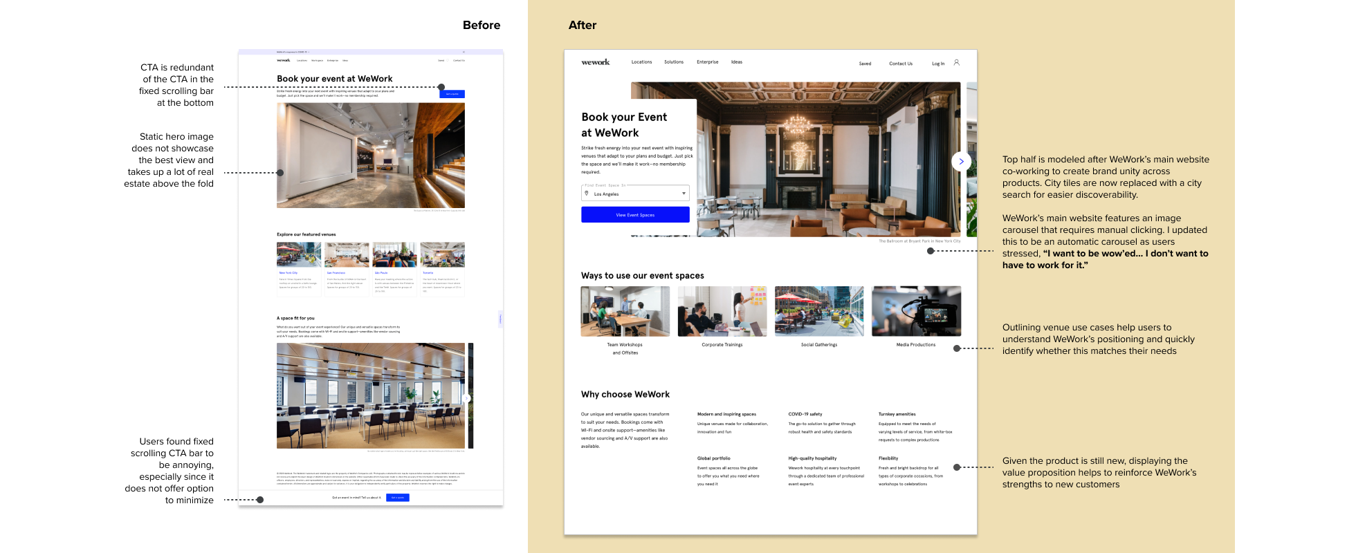
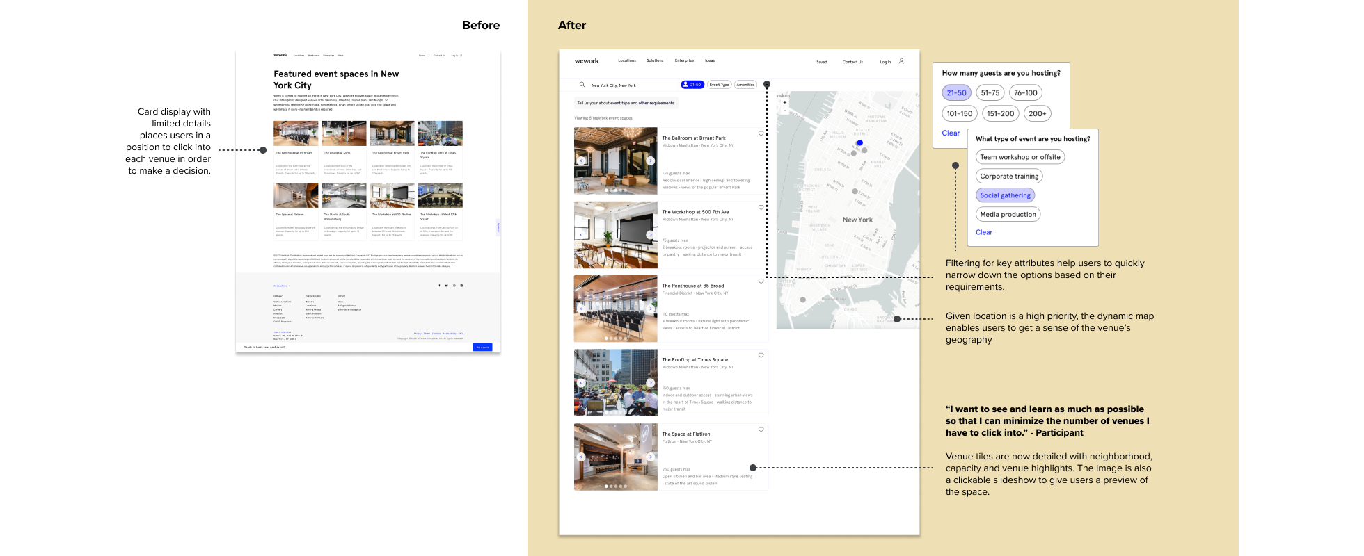
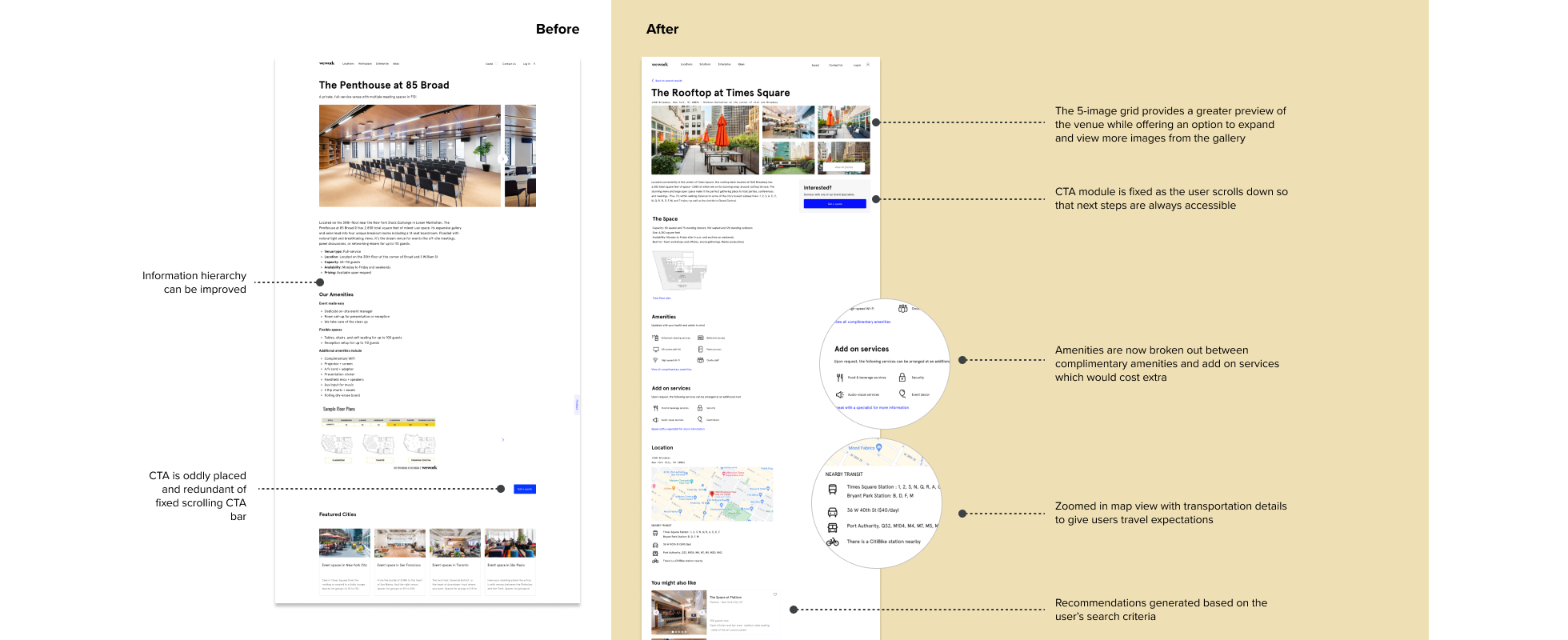
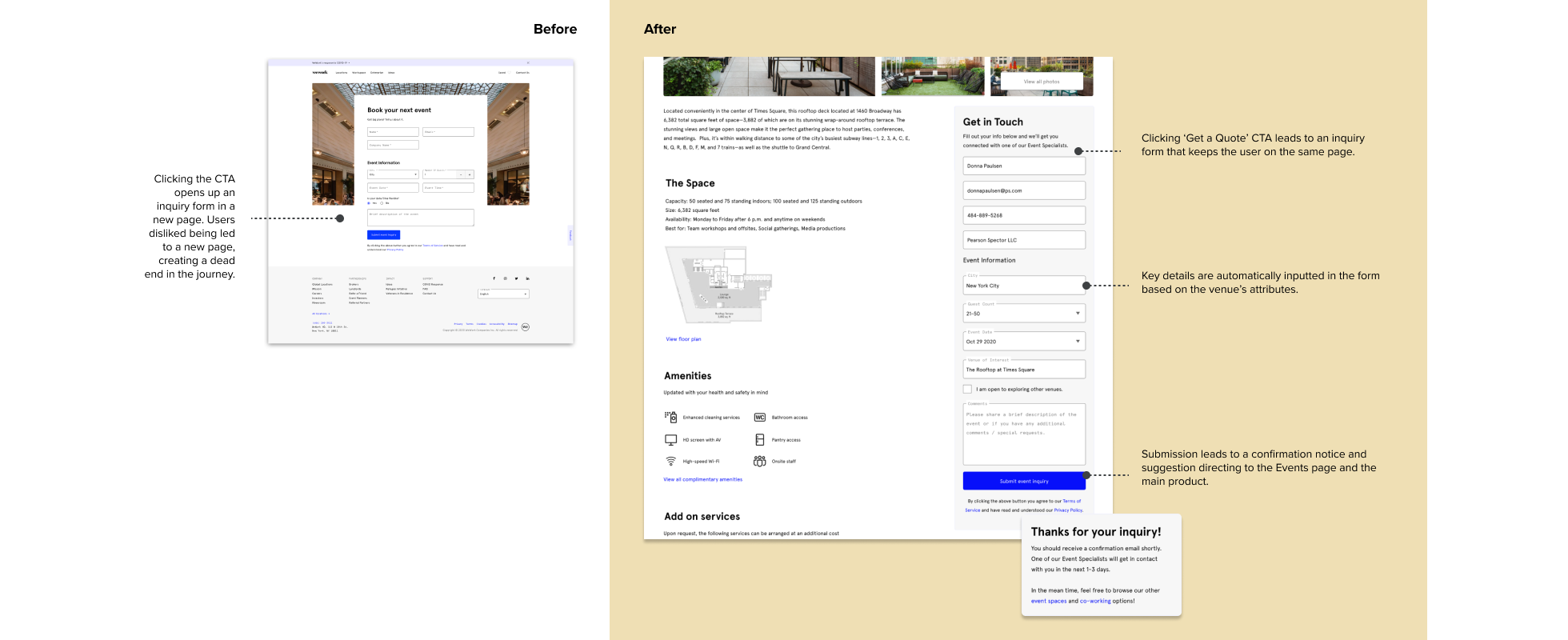
The images below show the final screen comparisons comparing the before (original Events website) and after (the redesign) side by side.

FINAL CONCEPT
The redesigned WeWork
Events website
The redesign offers a more efficient and informational experience, helping to strengthen new product credibility with users. The search function better supports the product as it expands geographic coverage. Additionally, the informative redesign helps to filter out users that don’t actually need this product, saving time for event specialists to work on more qualified leads.
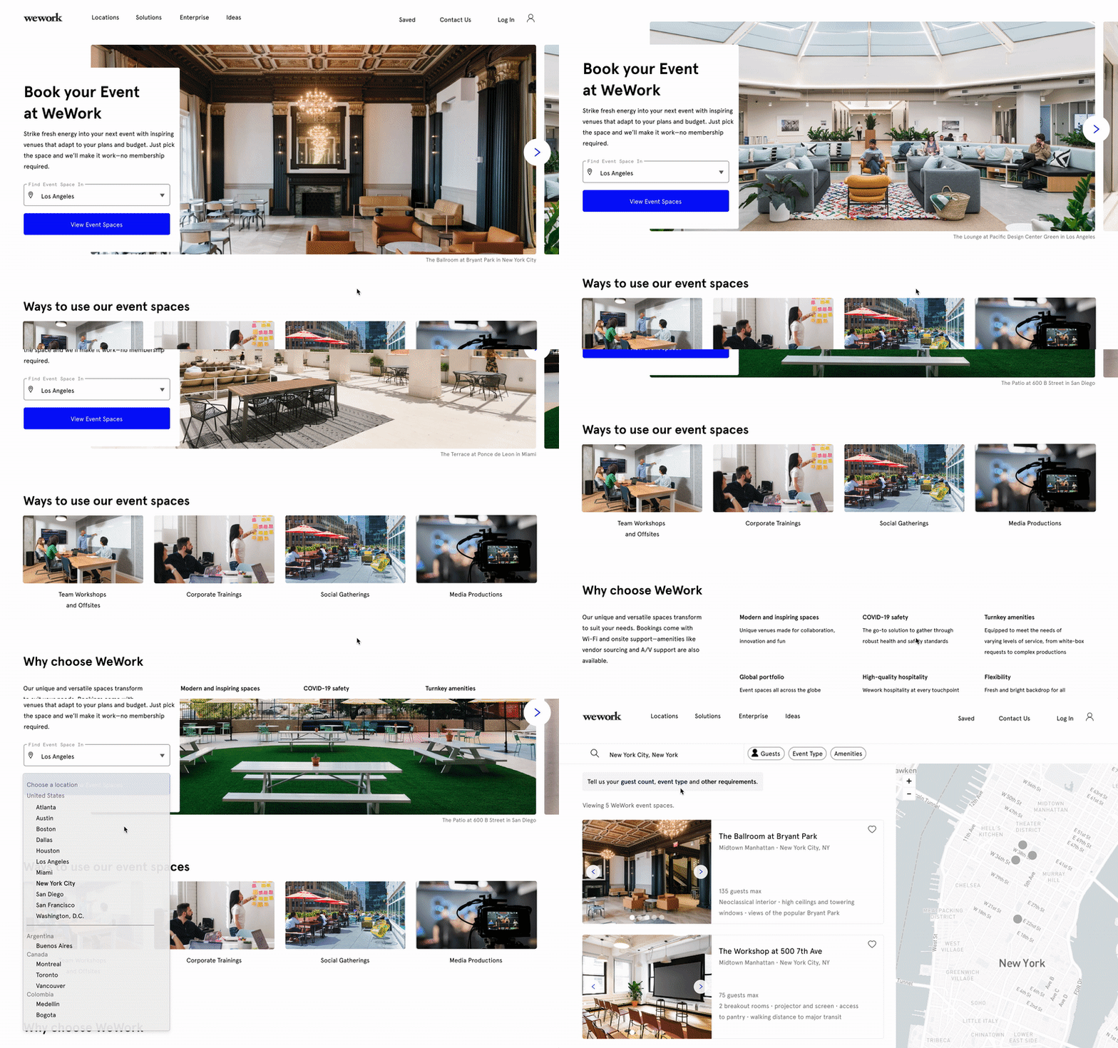
A WeWork-branded Events page
By displaying the value prop and use cases, the new Events product is now properly introduced on the homepage. The design has been updated so that it looks and feels more like an extension of the main WeWork co-working website.
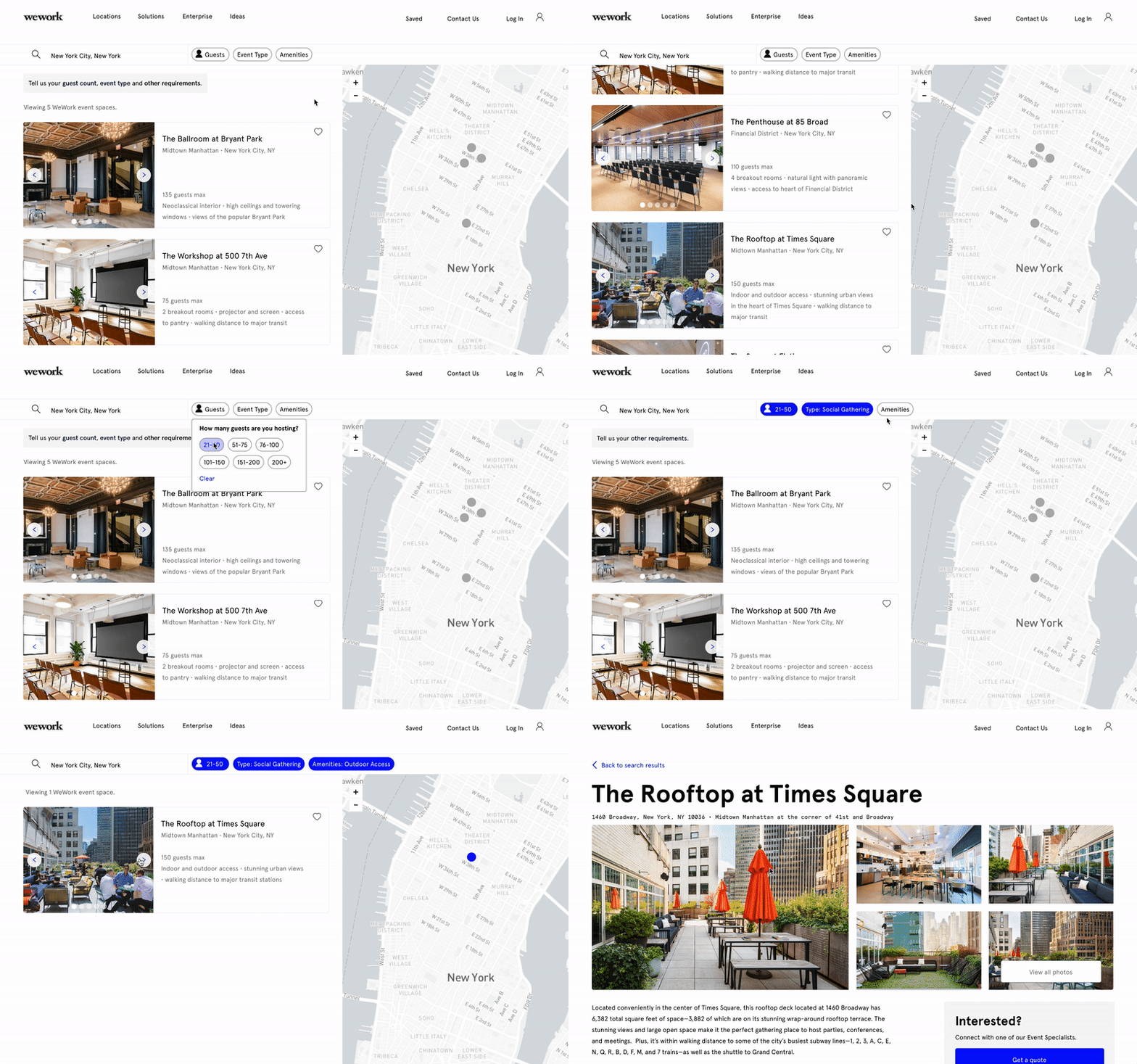
Searching for the one
Through an inventory search with attribute filters and a dynamic map, users can now quickly discover venues that meet their needs. Venue tiles offer additional images and details to help narrow down the options.
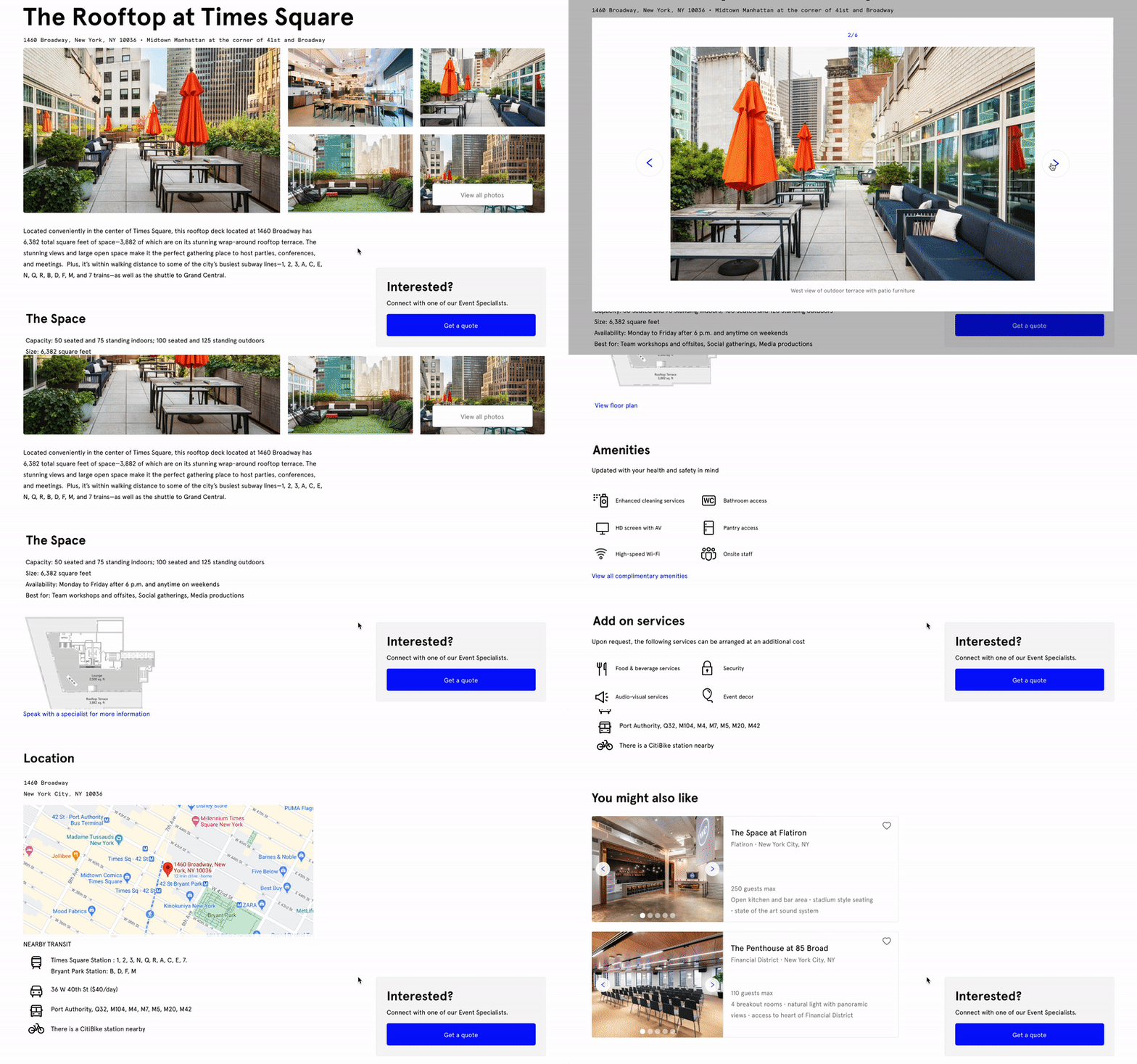
Information that makes the difference
Detailed venue information and images help to address users’ highest priorities— space (look & feel) and convenience (location and amenities).
REFLECTIONS
The redesign was both challenging and rewarding
I had a number of technical challenges to overcome but am happy with all of the growth that came with it. It was empowering to fuse my product thinking background with UX design to achieve an experience that was easy and enjoyable for users.
Limitations keep you in check. Having the business and product perspective was helpful in tightening the scope. It’s a reminder that there are always limitations to design around.
Time to expand the toolkit. I did everything on Figma, which started to reach its limitations in animations. I had to verbally describe some interactions to users for animations that couldn’t be achieved through the software. While I adapted to make it work, I know I need to learn more animation software to avoid these situations going forward.
It doesn’t end here. While this is one iteration, it’s exciting to think about how this could evolve as the product scales and more user feedback is collected. One day, features like 360-degree tour, venue comparison and customer reviews could be added into the mix to enhance the user experience.


