Engagement Dashboard for Actionaly
Equipping school administrators
with data to improve student outcomes
Actionaly is a messaging-based K-12 EdTech platform that streamlines communications between home and school
PROJECT BACKGROUND
Research has shown that family engagement is highly correlated with student outcomes, but school administrators historically had limited visibility into this information. If only they could access data that measured how engaged families are, they could then work to improve it to drive greater student success.
PROBLEM
Design a way for school/district administrators to review engagement of how the platform is being used in the community
OUTCOME
We created a visual dashboard that centralizes engagement data into a one-stop-shop, where admins can easily filter information to their needs and export the report to share at the next meeting. Our solution cuts the admin’s task flow time by 80%, leaving them time for more value-add activities.

Want to learn more? Feel free to dive into the process or skip to a section of interest!
THE PROCESS: DISCOVERY | SYNTHESIS INSIGHTS | IDEATION & ITERATION | FINAL CONCEPT | REFLECTIONS
DISCOVER
Actionaly had an opportunity to build up its limited reporting features to stay competitive in the EdTech space
To better understand the business & product, we interviewed Actionaly stakeholders and conducted a site analysis of Actionaly’s current capabilities as it relates to data & reporting. Site analysis (below) revealed that the current reporting capability is limited and unintuitive. As a result, the Actionaly team often created ad-hoc reports to address unmet reporting needs for schools.
User interviews revealed a tale of two users: tactical vs. strategic
The client had a hypothesis that there was a need for a visual dashboard to show aggregated data trends. When we conducted a couple of user interviews, we realized that there were two different admin users: a strategic user who wanted macro-data trends and a tactical user who didn’t.
We aligned with the client on further testing the hypothesis with the strategic user. Our goal was not to test usability, but rather to gauge general interest in a new dashboard feature— a concept test. If we couldn’t validate the client’s hypothesis, we would solve for the tactical user instead.
Although this hiccup set us off schedule, the clarity was key in sharpening the objective.
SYNTHESIS
Testing validated the need for a dashboard— Admins want easy access to data insights to inform leadership decisions
The client’s hypothesis was validated through testing— there was a need for this strategic analytics dashboard after all. We synthesized all of our research through affinity mapping to uncover patterns that could both sharpen our understanding of the user problem and establish an informed direction for our designs.
Meet Ms. Josefina & her struggle bus
Developing a persona, Josefina, the district administrator, and creating a map of her journey highlighted her pain points— extensive manual data manipulation on Excel. These enabled us to better empathize with our user, while keeping us anchored to the user problem at hand.

OPPORTUNITY
How might we help district administrators easily monitor family engagement so that they can make informed, data-driven decisions to improve student success?
DESIGN PILLARS
Insights informed our design direction rooted in 3 key themes
IDEATION
The next key challenge was figuring out which metrics were most relevant to users and how to organize it all
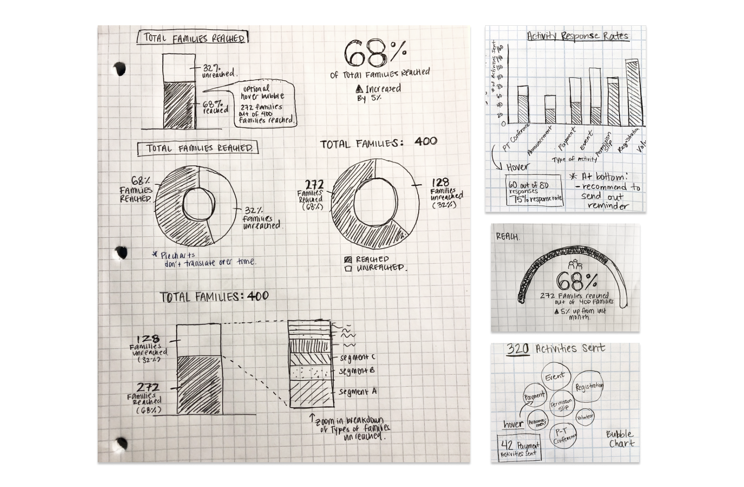
We brainstormed different data points that could be of potential interest to our users and organized it as mutually exclusive and collectively exhaustive as possible. Leveraging research insights, we narrowed down to 4 major data categories, and sketched ways to visualize the data.
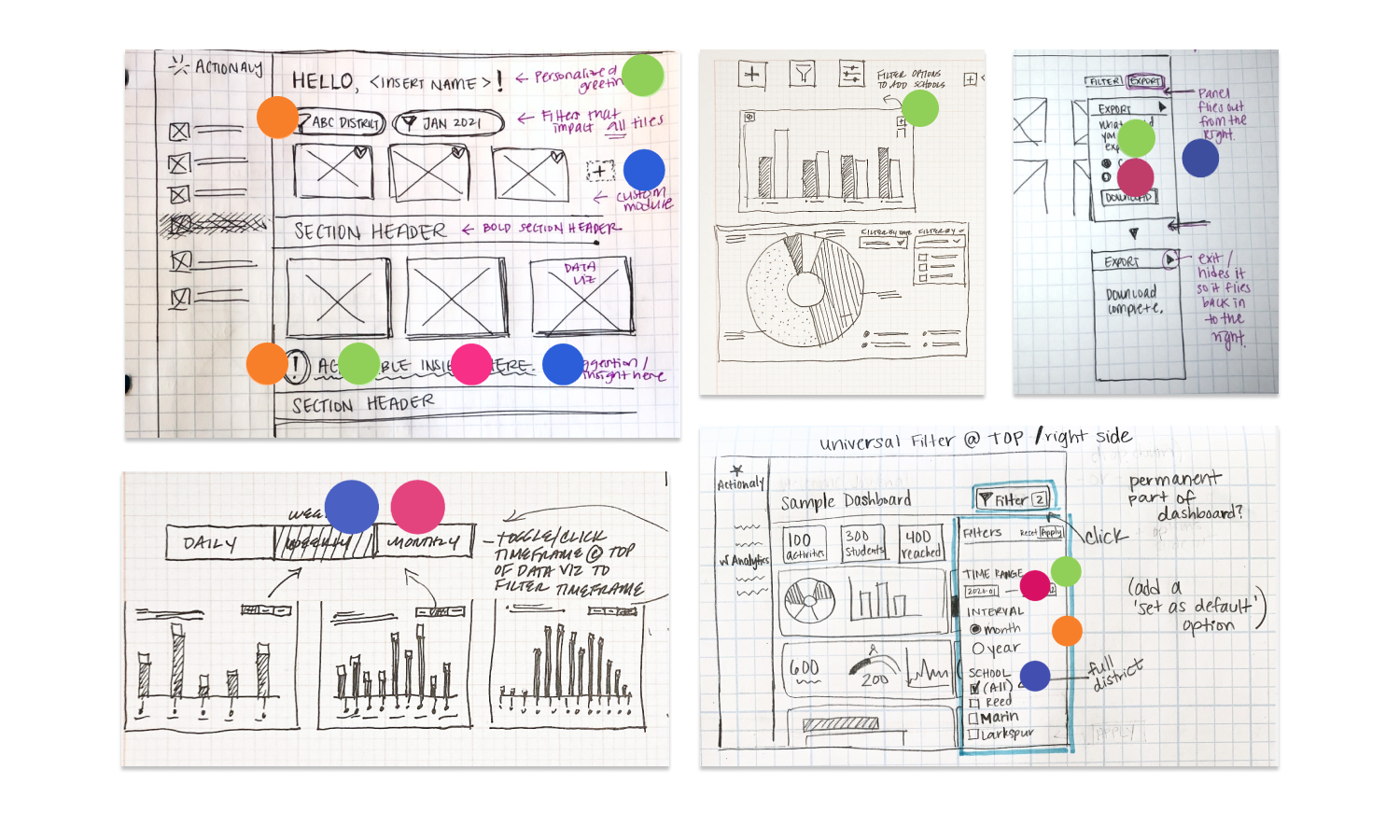
We then focused on the dashboard’s functional features, ideating on ways for users to customize and share data. We created task flows to map how the user would move through the dashboard.
TESTING & ITERATING
Combining our best ideas into a mid-fi prototype for testing
We kept the prototype in greyscale intentionally to limit color commentary (which later proved to be problematic). Through user testing, we aimed to validate the information architecture, relevance of the data, as well as the feature functionality of the dashboard.
User testing showed problems over scrolling, data viz & more
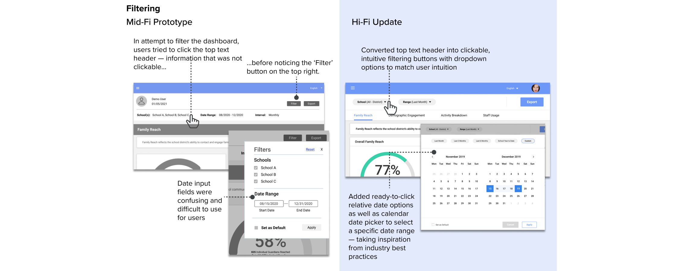
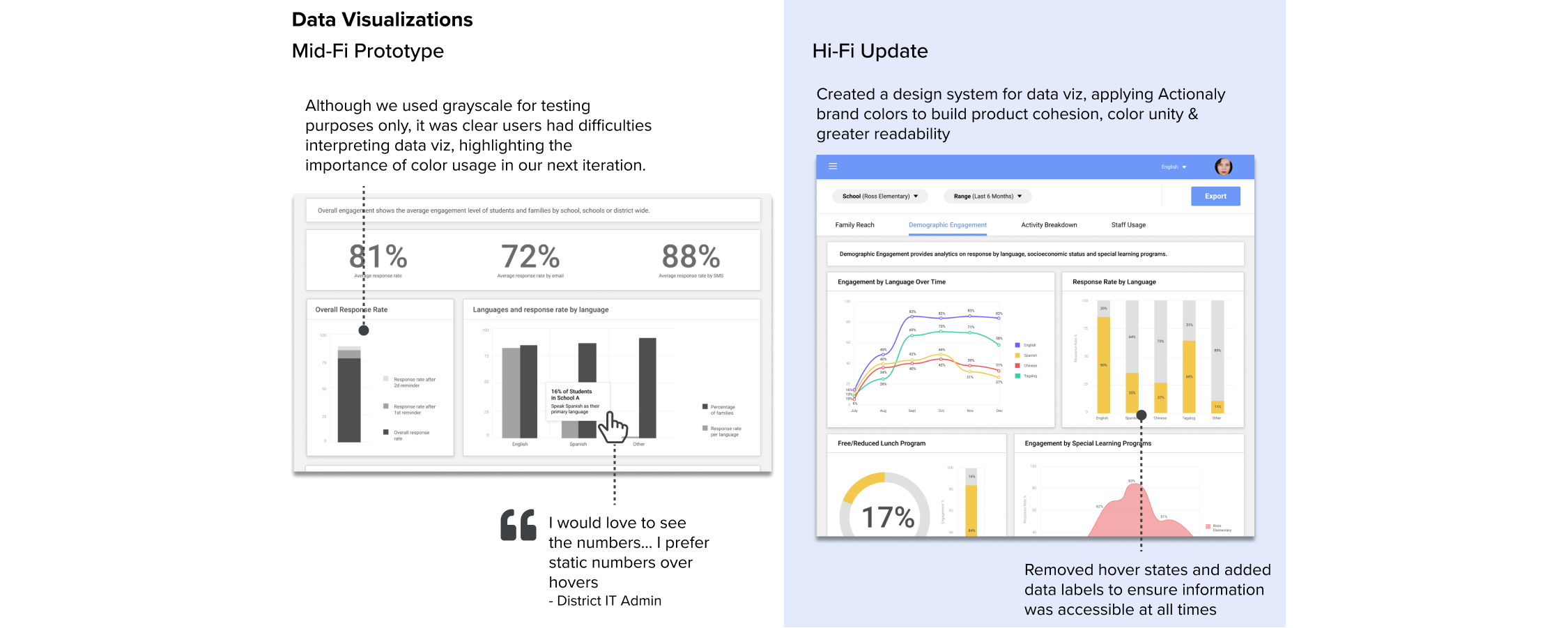
Taking this feedback, we iterated on the designs to address the observed problems. Below highlight a few redesigns, comparing the mid-fi prototype feedback (left) and the revisions (right) made to address it.

FINAL CONCEPT
Introducing Actionaly’s engagement dashboard:
one-stop shop for data
Admins are now armed with data on how their school(s) are trending and where they should target their efforts to improve.
Customize to your needs
With options to filter and set a default view, users can quickly view the information they need to drive their next leadership decision
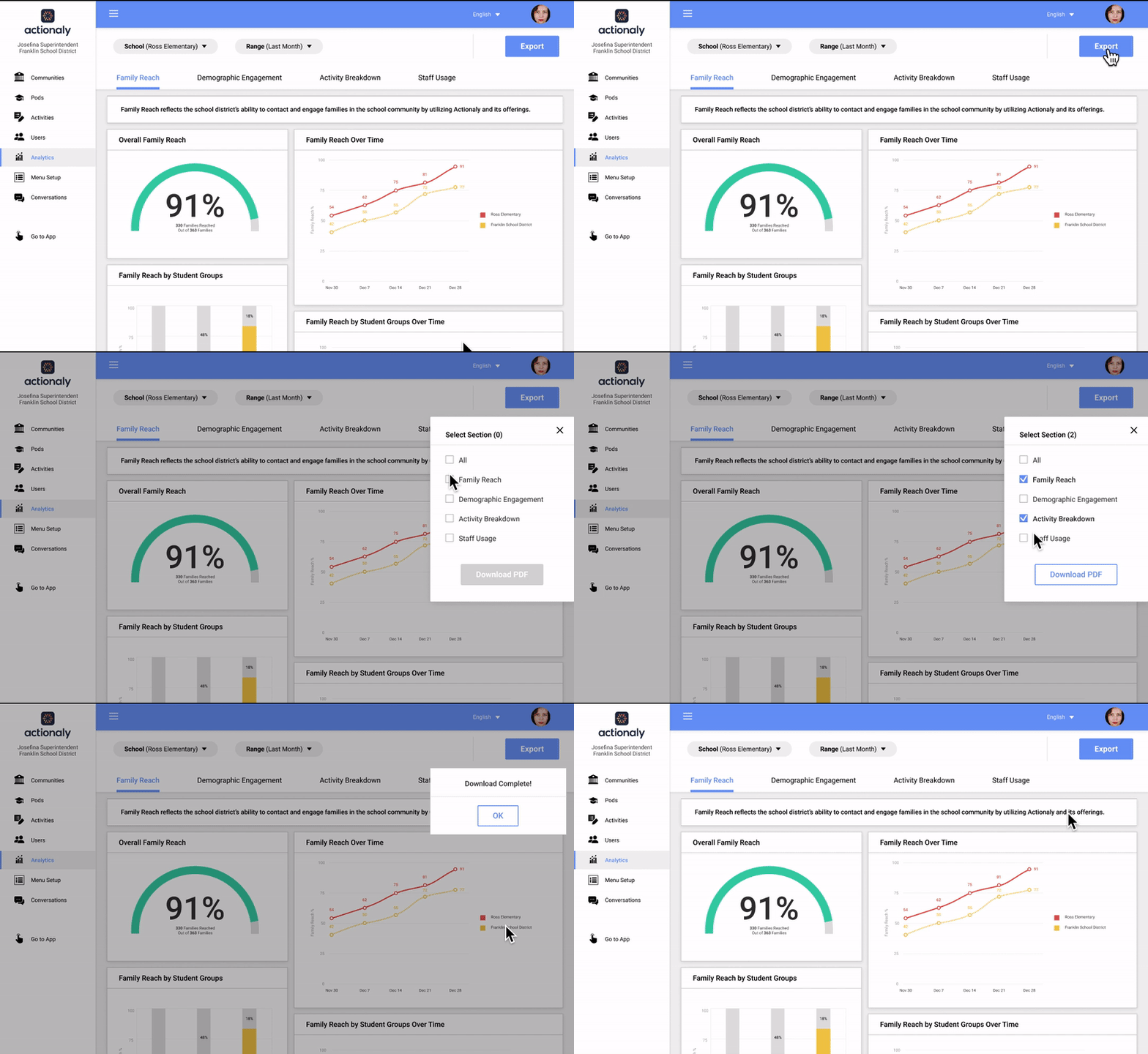
Ready to share
With options to export specific sections into PDF, users can efficiently take what they need for the next board or stakeholder meeting.
Prototype in action
Check out the dashboard experience
REFLECTIONS
The end is just the beginning
The client was pleased with the final product and excited to finally have his dream feature be added to his product roadmap for development. The new dashboard helps reduce an admin’s task flow from hours to mere minutes, and greatly alleviates the current ad-hoc requests for the Actionaly team.
Looking back on this project, some key takeaways are:
Planning only gets you so far. While it’s ideal to establish the objective and scope early on, sometimes you don’t know what you don’t know until you get there. Adaptability & alignment is key!
Don’t Reinvent the Wheel. With a userbase that may not be the tech-savviest, stick with popular design patterns to reduce cognitive load (it saves time too!).
Be the MVP advocate. It’s easy to get distracted by the many great feature ideas, so focus on creating a plan that prioritizes key areas and delivers a quality MVP on time.


